

Data Analysis
Coffee Talk Animated Infographic
Information Design and Data Tracking
For this project, I transformed my daily coffee consumption over four weeks into a visual and interactive experience.
To do this, I created an animated infographic that identifies patterns and is measurable against national averages.
Initial Sketches

The piece aims to be easy to understand and visually appealing, while effectively highlighting key insights from my personal data.
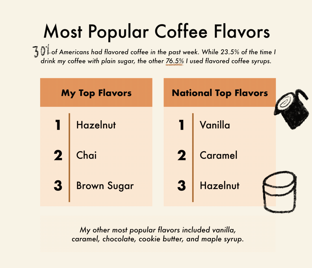
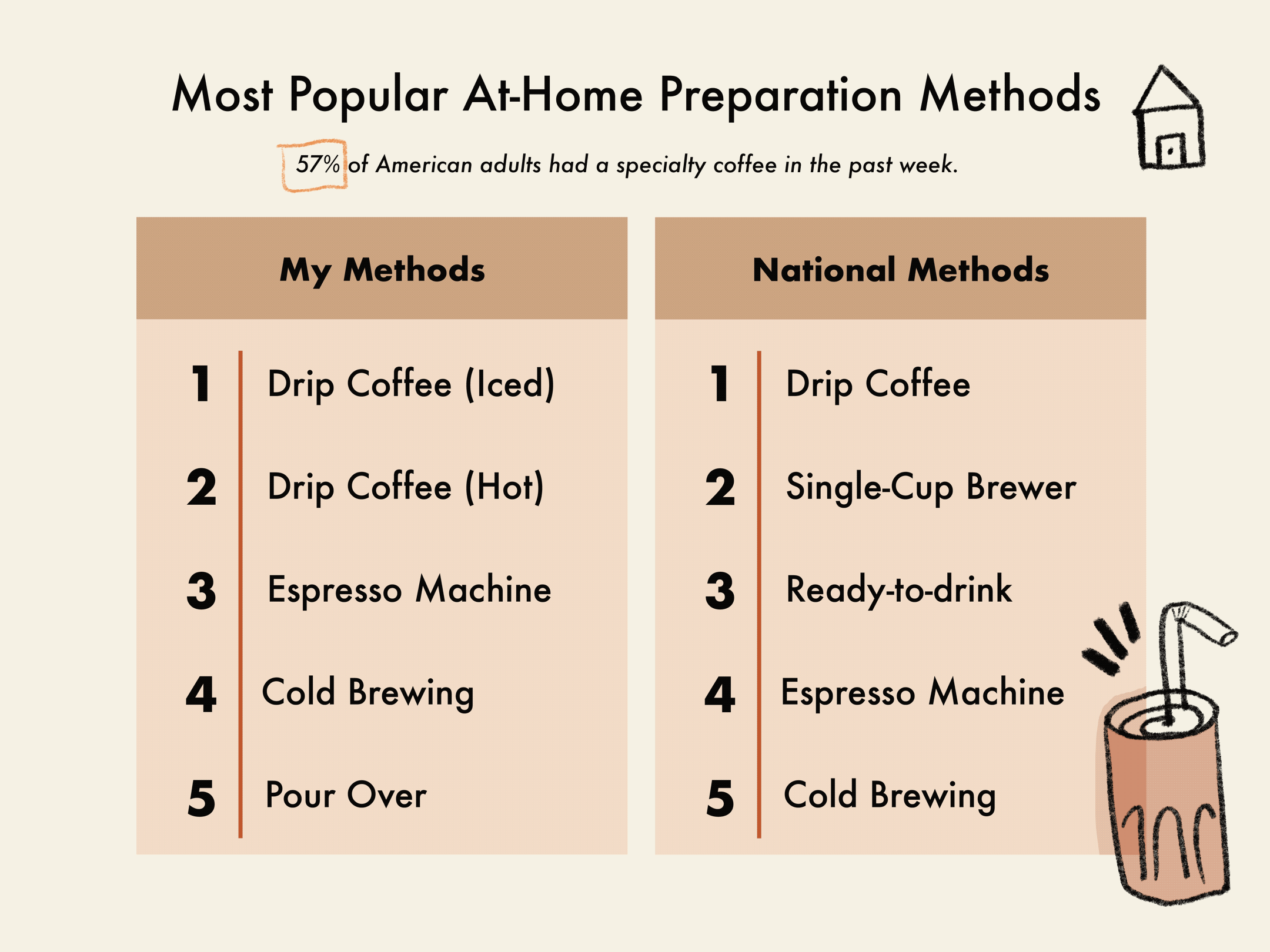
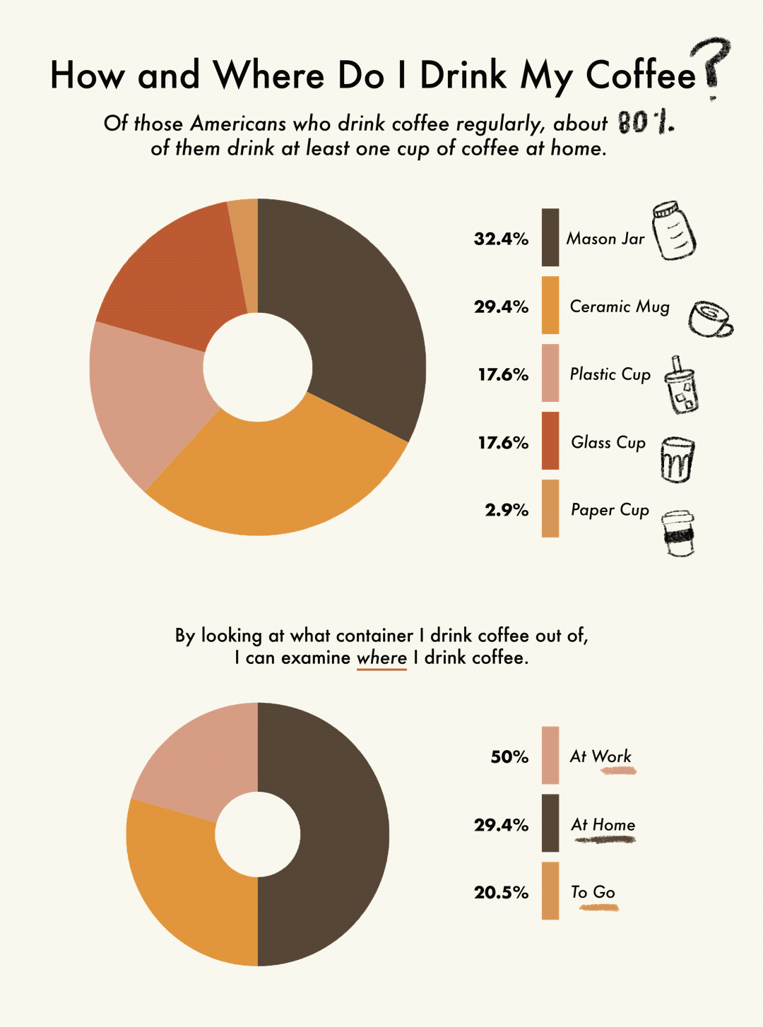
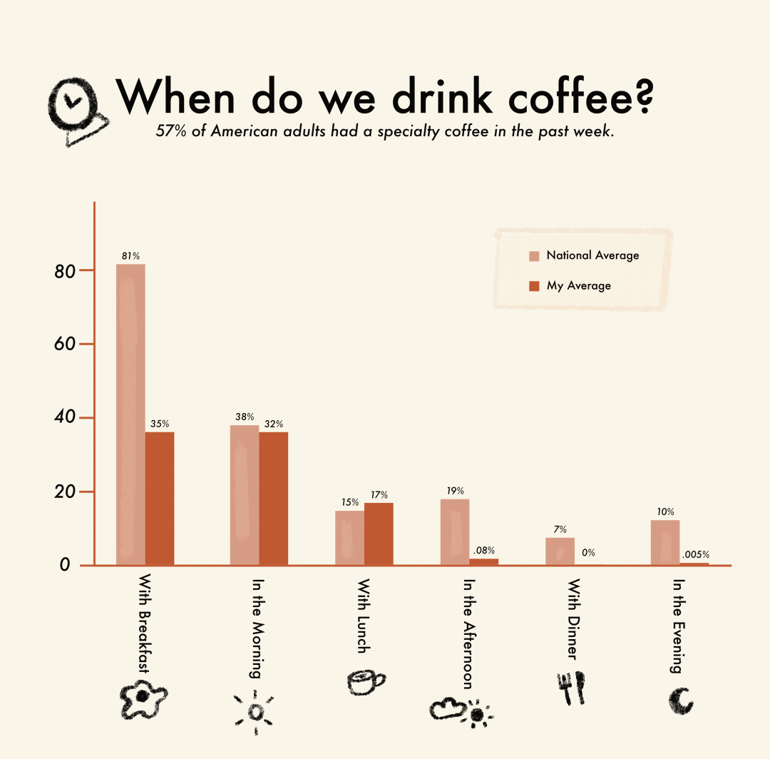
I tracked my coffee consumption over 34 days, to gather how, why, when, where, and how much I drank. Comparing my statistics to the national average revealed unique correlations.

All contained in an illustrated poster, the final document allows the viewer to click through each data set themselves.
Click here to view the final document!